The Problem

Suppose you are having a busy time at the office just when an email pops in which says something about an upcoming meeting. You recall the previous discussion of the meeting topic and look for the last MoM file in a mail thread. You also need to find the presentation which was sent by your secretary on another thread. Suppose this is happening frequently enough and as you look through your piled up inbox, you wonder if there were some efficient way to do this which could save your time; something that required fewer efforts.

The board directors of Cleartrip were facing the same problem above and the problem-solving folks there decided to do something about it.
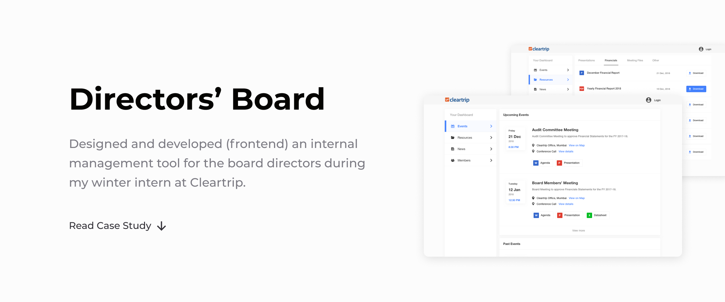
Project and My Role

Cleartrip is a global online travel company. I interned at its Bengaluru office as a Product Designer for about a month, during the winters of 2018.

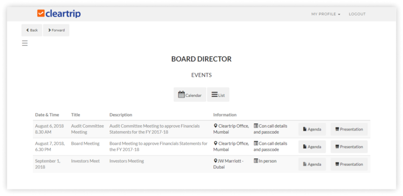
Sahil Kharkhanis, the design manager, introduced me to this problem. He told me that they're planning to build a platform where everything of concern to the board directors would be well-organized for easy task management. An initial version (the developers' version 😛) of this was already made:

Sahil asked me to design this product from scratch; research, find the pain points in the current process, come up with some solutions, go onto Sketch using the design guidelines of Cleartrip, and develop a prototype.

With this, I was all set to dive into this project.

Initial Research

Talking with the folks at Cleartrip, I tried to gather as much information as possible about the problem space, the users (the directors) and the initial version. Apart from Sahil, Devanshu Bhatt, product design lead and a really cool guy, mentored me throughout the project. I also talked to a guy named Chirag- he was responsible for this product's functioning mechanism and worked closely with the directors.

User Persona

Based on the information collected, I tried to sum up the typical user's goals and pain points through a persona.

Concept Definition

Idea behind the design.

• We'll be designing a portal for the user where every information and resource of his concern is well organized.

• To further reduce the hassle of looking for things, we'll provide a dashboard for this portal, which will display the most relevant stuff upfront without going deeper.

• The portal should follow the overall look and feel of Cleartrip products.

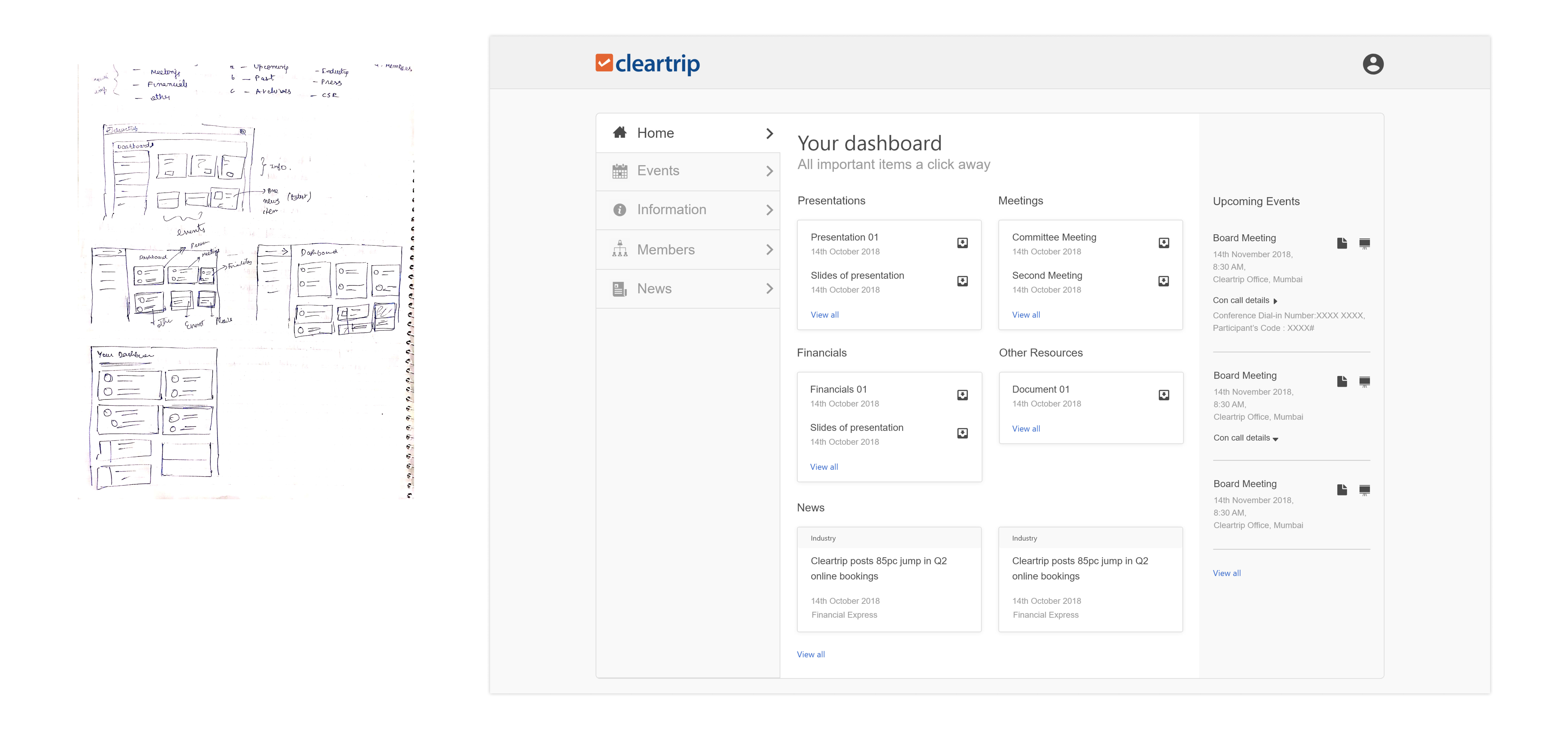
First Wireframe

I explored some ideas (pencil sketches on the left) and came up with the solution on the right. The dashboard provided an at a glance preview of crucial information at that moment and an easy way to navigate directly to various areas of the portal.

Although this solution seemed viable, after discussing with Sahil and Devanshu, I realized a few problems with this design:

• The hierarchy of displayed information- what is more important to display at that moment.

• Upcoming events are going out of the main area, therefore, they seek less attention. This might be a problem if they are the most important thing for the user.

• Lack of affordances at the elemental level- what actions can be taken with the displayed files, news item or event.

• Decision making at UI level- Whether to use a 2 or 3 column layout, card or list-based approach.

A Step Backward

Asking the right questions.

One day in the office, when I was thinking hard about what can we do to improve the design, Devanshu came to me and suggested taking a step backward, going again to the research phase and asking the right questions to get a better understanding.

Some of the questions which I figured out with his help:

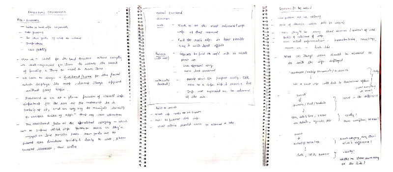
When I searched for answers to these questions talking to Chirag and Sahil, I got some very good insights:

• Dashboard order of importance- Upcoming Events and resources, news, members.

• All attachments (agenda and presentations) are uploaded, manually, by Chirag. Pdf, excel sheets and word docs make up for 99% of these attachments. 30 character excluding extension is the average document name. (min 10-15, Max 40-50 characters).

• There is a scenario when documents to download are not tied up to a meeting/ event. (eg: Financial reports). Based on what Chirag understands today, it makes sense to give him this flexibility to upload such documents, which are independent of meetings. Directors find quick access to all documents very useful.

• Events (meetings)- upcoming events are of most importance. There are one to three meetings in a month. Past events are rarely revisited unless they have attachments to download.

• News- Chirag curates news articles manually, avg 4 articles per month. He has no time, resource or mechanism to go through each article in detail and summarise it for the directors.

• Members- New members get added rarely. The least important thing for the directors to see.

Concept Redefinition

The purpose of the dashboard was to display the most relevant information to the user at a glance. It turned out that the most relevant information was events(mostly meetings) and resources(files). Also, the resources were generally associated with an event, except for some independent files.

This meant we really didn't need a dashboard!

Second Wireframe

In the second round of iteration, the user landed directly on the meetings page since this is of most importance, removing the extra step that existed before. Overall navigation had been made simpler and more usable by the use of a persistent left nav for key pages along with the use of horizontal navigation within a page (if required).

We all agreed that it was a pretty good approach. The only things that needed improvement were:

• At the elemental level- in terms of consistency and interface patterns.

• Overall- unification with other Cleartrip products.

Further Iterations

I did a few iterations with the elemental parts and tried to create a consistent UI pattern across the displayed information.

• Upcoming and Past Events: Used a list to display events for easy scanning, removed the calendar as a low frequency of events (1–3 in a month) would leave most of the dates empty.

• Resources: Retained the horizontal navigation, showing a list of 6–7 items at a glance was sufficient for the requirement.

• News: A list view showing 3–4 articles in one go, no summary.

Final Prototype

After a few more twitches to align everything with the Cleartrip look and feel, I prototyped the designs in HTML/CSS and handed it over to Sreejith, who would continue with developing the product after my internship.

Summing Up

Learning and takeaways

Coming out and working on real-world products is always a great opportunity to learn for self-taught designers like me. There were a lot of positive takeaways and a joyful experience that I got from this internship at Cleartrip.

Next Story

How I designed Otomate - Smart Home App

Have something interesting, I'm always up for a chat.