It's fascinating to see the evolution of mobile phone interfaces over the last few years - from blackberry with keypads to the latest range of big-screen iPhones. With the coming of VR/AR and high-quality surface desktops, our interaction with technology keeps getting more and more immersive. But imagine a new dimension of human-computer interaction where our life-experiences are enhanced by relating more to the real world with a subtle touch of technology… Kudos if you guessed it right! This dimension already exists. With the new wave of smartwatch and voice UX, the interactive screens are simultaneously getting smaller and smaller to even no interface at all, taking us closer to a less distracting world.

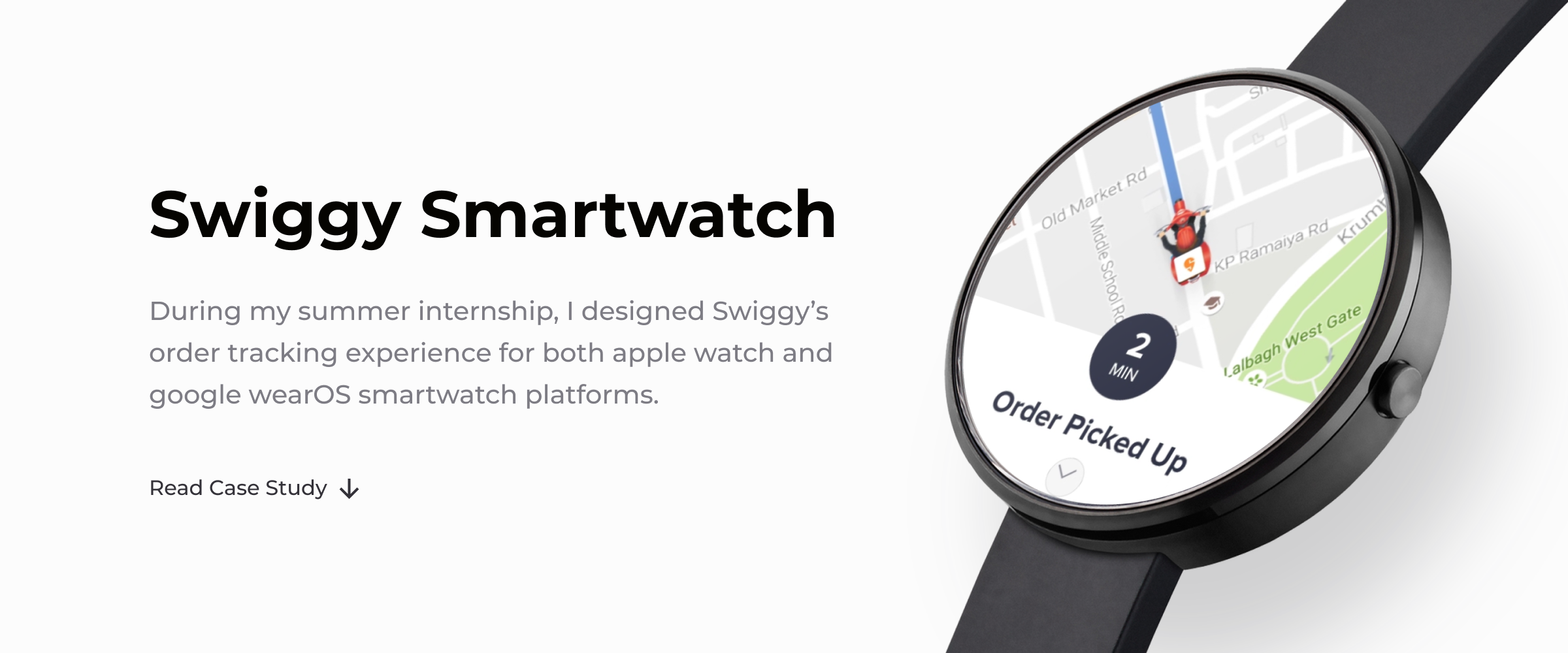
During the summers of 2019, I got a chance to work in the new dimension (you know what I mean) during my product design internship at Swiggy - India's largest food ordering and delivery company. This article describes the story of how I designed the smartwatch app for Swiggy starting from scratch to finally see my intern project getting shipped.
Understanding the Product

Asking the experts.

It was just two weeks into my internship when my design manager, Saptarshi Prakash told me about the project and asked me if I would be willing to design the smartwatch experience for Swiggy. I agreed, knowing that I had never used a smartwatch before let alone designing for one. But I wanted to learn something new and the best way was to take up the challenge.

Before diving into the design process, I wanted to have an understanding of what the product was about, why are we building this, what problems are we trying to solve and for whom, etc. So, I went around the Swiggy office finding answers to these questions:

1. The data science team discovered that users spend a lot of time on the Swiggy app's order tracking screen as they want to know how far their delivery executive is and how soon they can expect their food. They come back to the order tracking screen multiple times in the time span of 20 to 45 minutes (the expected delivery time) just to keep a tab on their order.

This type of behavior hinders any other real-world activities you may wanna do. For eg. suppose you're on your desk in the office and instead of working you're gazing your mobile screen to know how far is the food you ordered for lunch, or you're working out but checking your phone again and again for the energy shake you've ordered.

2. Talking to the product manager, I came to know the strategy behind solving this problem. For some of our premium users who use a smartwatch, we were planning to enable simple workflows of the Swiggy's food ordering experience on wear OS and apple watch - starting with the tracking experience for now. Apparently, interacting with these wearable computing devices is less distracting (the next thing was to find out how!)

Research

Methodologies and Insights

I knew very little about smartwatches or wearables and it was necessary to have a good understanding of how people use smartwatches, what problems they solve, things to consider when designing for them, etc. I began with some online research - yes! internet, the magical world where someone probably had faced the problem you're facing and is available to help you out.

To better understand how the ordering experience really worked and what goes behind the scenes after an order was placed from the Swiggy app, I also spent a day with one of the delivery executives going from restaurants to customers, doing a few food deliveries myself on the roads of Bangalore.

The people at Swiggy not only work here but most of them are avid Swiggy users themselves which means they have their own experiences, aspirations, disappointments, etc. from a user's perspective. Some of them used a smartwatch as well which was great for me as I could get so many insights from the team only.

Some useful insights that I got from the research:

• Smartwatches aren't miniature versions of our mobile and desktop computers. Instead of cramming everything on a small screen, we should aim for lightweight interactions, quick workflows, and simplicity.

• Watches constantly move, are looked and interacted at unusual angles; therefore their attention spans are low, unlike the smartphones which demand complete attention and interrupt real-world activities. Notifications and glanceability rule the world of smartwatch design.

• A typical food ordering workflow on Swiggy is rather complex. There are a lot of restaurants and dishes to choose from, people may change their minds at any point, even the tracking experience is not straightforward when something goes wrong and the customer support or delivery executive intervenes.

• Apple and Google have provided their own visual language and design guidelines for iWatch and wearOS (respectively). One does not have much scope of deviating from the guideline as it's the way that a smartwatch user is supposed to expect.

Defining the Problem

The end goal to achieve: How to make order tracking a more convenient experience for the end-user.

For the tracking experience on a smartwatch, I tried to break down the design problems that we wanted to solve in 'how might we' statements:

• HMW design a more subtle experience instead of an immersive one.

• HMW allow users to do other activities while keeping them informed all times.

• HMW benefit the holistic experience of ordering food.

Solving the Problem

I figured out that the value proposition of a smartwatch was to provide the core experience of tracking the order by providing just the right information at just the right time, without distracting the user from any other real-world activities. For complex tasks like browsing restaurants/dishes or contacting the customer support/delivery executive, the user could always come back to his smartphone in the digital ecosystem of his watch.

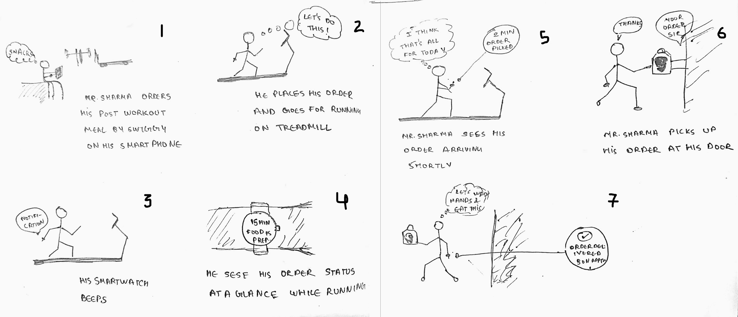
With this, I could gather my thoughts and begin with some ideation keeping the HMWs in mind. I sketched a storyboard to visualize the entire journey of a character ordering food and how might he interact with his smartwatch.

Designing the Interface

Putting things together in Sketch.

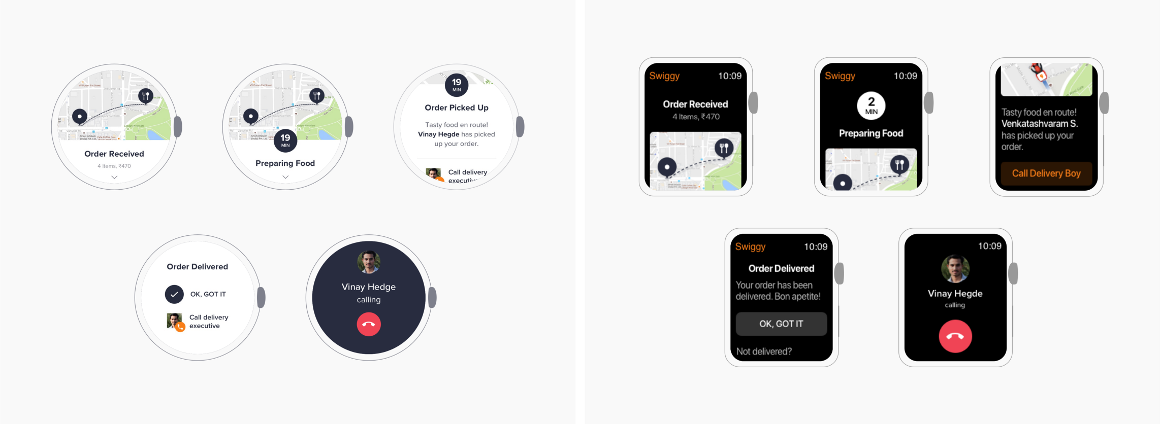
• I tried to keep the interface minimal and simple, showing only the most relevant things at a glance keeping in mind the short interaction span that a watch offers.

• I removed the map (which shows the location of the restaurant, delivery boy and the location to be delivered) because a complex task like interacting with a map is a pain on a smartwatch. Imagine zooming or panning on such a small screen!

• The most important information that people will look for is the status of their food order. I tried to keep the focus on what is currently going on and how long will the delivery take, even in the notifications which are the most frequently interacted part of any smartwatch app experience.

Design Feedback

The next thing was to take feedback on the design from everyone. Showing the designs on a Sketch artboard was definitely not worth it and we wanted to get a prototype as close as possible to the real experience. So, Sapta (my design manager- this is we usually call him) suggested putting the screen images on a real smartwatch.

• The most common feedback was - as a user when I tap on the status notification and go to the main app, it essentially shows me the same information for the active step. So, there was no worth of opening the app as no one was actually interested to scroll and see inactive steps.

• The idea of removing the map didn't work. People actually expected to see the map as it works as an assurance that everything is going right. So, even if interacting with a map on a small screen is difficult, just seeing the delivery bike's icon gave an idea of how far is the food and if it's coming the right way.

• There were some visual design problems like the ETA on wearOS looked like a button and many tapped on it; using an icon with the left aligned text on apple watch was making it cluttered; and how to decide the hierarchy of information: ETA, status, description.

Back to the Artboard

Based on the feedback, it was time to go back to the artboard and iterate some more explorations of the concept. UI that we arrived at finally:

Final Prototype

Developing to Pixel Perfection

The app then went in the development phase for both the platforms. The next thing, I sat with the developers adjusting the fonts, spacing and literally every pixel till it looked perfect on every real smartwatch (which in Swiggy lingo is called PP or Pixel Perfection). The app finally got shipped, initially for a few test users and then recently for everyone.

Final Takeaways

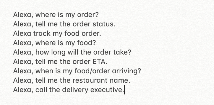
This project was a big step towards the goal of providing a more convenient and less distracting experience to our users. As part of the strategy, we were also planning to implement tracking the order with the help of Alexa voice assistant. And in future, simple workflows of order placing might be enabled on a smartwatch- like previously ordered items or Swiggy POP

Among the other things that I did as a product design intern, this project was a special one because it got shipped for the people to use and there was a ton of things to learn throughout the journey. Read my article on medium to know more about my experiences and lessons that learned as a design intern at Swiggy.

Next Story

Between Two Worlds - Game Design Process

Have something interesting, I'm always up for a chat.